Responsive Web Design: Why It’s Essential in a Mobile-First World
Mobile devices have become an integral part of our lives in today’s digital landscape. From smartphones to tablets, people constantly access the internet on the go. As a result, it has become crucial for businesses and individuals alike to adopt a mobile-first approach to web design. This is where responsive web design comes into play.
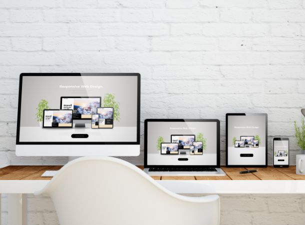
Responsive web design is a design approach that aims to create websites that provide an optimal viewing experience across a wide range of devices and screen sizes. It involves building a website that automatically adjusts its layout, images, and content to fit the screen it is being viewed on, ensuring a seamless and user-friendly experience.
The concept of responsive web design was introduced by Ethan Marcotte in 2010, and since then, it has revolutionized how websites are built. In the past, developers had to create separate versions of a website for desktop and mobile devices, which was time-consuming and often resulted in inconsistencies between the two versions. With responsive design, a single website can adapt to different screen sizes, eliminating the need for multiple versions and streamlining the development process.
So, why is responsive web design important in today’s mobile-first world? Here are a few key reasons:
- Improved User Experience: Responsive websites provide a consistent and optimized device experience. Users can access the same content and features regardless of whether they use a smartphone, tablet, or desktop computer. This enhances user satisfaction and encourages longer browsing sessions.
- Increased Mobile Traffic: Mobile devices account for a significant portion of internet traffic. With a responsive website, you can tap into this mobile audience and ensure that your content reaches users on their preferred devices. This can lead to increased traffic, engagement, and conversions.
- Cost-Effectiveness: Developing and maintaining separate website versions for different devices can be expensive. Responsive design eliminates duplicate development efforts, saving time and resources. Additionally, updating content and making design changes becomes much more efficient with a responsive website.
- Better SEO Performance: Search engines like Google prioritize mobile-friendly websites in their search results. Having a responsive website can improve your search engine rankings and visibility, ultimately driving more organic traffic to your site.
- Adaptability to New Devices: The landscape of devices constantly evolves, with new smartphones, tablets, and wearables being introduced regularly. Responsive web design ensures your website can adapt to these new devices without requiring major redesigns or overhauls.
- Competitive Advantage: A responsive website can give you an edge over your competitors in a competitive online market. A well-designed, mobile-friendly website can attract and retain users, boost your brand image, and differentiate you from businesses that haven’t embraced responsive design.
What is Responsive web design?
Responsive web design is a web design and development approach that aims to create websites that adapt and respond to the user’s device and screen size. In other words, the website layout and content adjust dynamically to provide an optimal viewing and interactive experience on a wide range of devices, including desktops, laptops, tablets, and smartphones.
The main goal of responsive web design is to eliminate the need for separate versions or dedicated mobile websites for different devices. Instead, a single website design is created that can fluidly adjust its layout, content, and functionality based on the screen size and capabilities of the device being used.
Here are some key aspects and techniques associated with responsive web design:
- Fluid Grids: Responsive websites use flexible grid systems that adapt to different screen sizes. Grids are designed using relative units like percentages rather than fixed units like pixels. This allows the content to automatically resize and reflow within the grid as the screen size changes.
- Flexible Images and Media: Images and media elements, such as videos or embedded content, are designed to scale and adjust proportionally with the layout. This prevents images from being cropped or overflowing the screen on smaller devices, ensuring they fit properly within the available space.
- Media Queries: Media queries are CSS techniques used to apply different styles and rules based on the characteristics of the device, such as screen width, orientation, and resolution. By using media queries, designers can specify specific CSS rules for different screen sizes and optimize the layout accordingly.
- Breakpoints: Breakpoints are specific screen sizes at which the layout of the website is adjusted. Designers define breakpoints in the CSS to trigger changes in the layout, such as repositioning elements, modifying font sizes, or hiding certain content to enhance the user experience on different devices.
- Mobile-First Approach: In the mobile-first approach, designers initially prioritize the design and development for mobile devices and then progressively enhance the layout and features for larger screens. This ensures a streamlined experience on mobile devices while taking advantage of additional capabilities on larger screens.
- Usability and Touch-Friendly Interactions: Responsive design also considers touch-based interactions common on mobile devices. Buttons, navigation menus, and interactive elements are designed to be easily tappable and finger-friendly, improving the overall user experience on touchscreens.
By implementing responsive web design principles, websites can provide a consistent, user-friendly experience across various devices and screen sizes, ultimately improving accessibility, engagement, and user satisfaction.
Adjusting Screen Resolutions
Adjusting screen resolutions refers to changing the display resolution settings on a device to alter the number of pixels used to render content on the screen. By adjusting the screen resolution, you can increase or decrease the amount of visual information displayed, affecting the clarity, size, and overall appearance of on-screen elements.
Here’s how adjusting screen resolutions typically works:
- Access Display Settings: To adjust the screen resolution, you need to access the display settings on your device. The process may vary depending on your operating system and device. You can find the display settings on most devices in the system settings menu or control panel.
- Select Resolution Options: Once you access the display settings, you will typically see a list of available resolution options. These options represent different configurations of width and height in pixels that the display can support. Common resolutions include 1920×1080 (Full HD), 2560×1440 (2K), or 3840×2160 (4K).
- Choose Desired Resolution: Choose the desired resolution that suits your preferences or requirements from the list of resolution options. Higher resolutions generally offer more detail and sharper visuals, while lower resolutions can make on-screen elements appear larger.
- Apply Changes: After selecting the desired resolution, apply the changes. The screen may flicker briefly as the display adjusts to the new resolution. Sometimes, you may be prompted to confirm the changes before they take effect.
- Evaluate the Result: Once the resolution changes are applied, evaluate how the content appears on the screen. Higher resolutions can fit more content on the screen but may make text and icons appear smaller. In comparison, lower resolutions can enlarge on-screen elements but may sacrifice some detail and clarity.
- Fine-tuning: If needed, you can experiment with different resolutions to find the optimal balance between screen real estate and readability. You may also need to adjust other display settings like scaling, brightness, or contrast to refine the visual experience further.
It’s important to note that not all devices or displays support all resolutions. The available resolution options may depend on the capabilities of the device’s graphics hardware and the display’s specifications.
Adjusting screen resolutions can be useful in various scenarios, such as optimizing the display for specific applications, adjusting to the capabilities of external monitors or projectors, or accommodating visual preferences based on individual comfort or accessibility needs.
Flexible Everything For Mobile First World
In a mobile-first world, where mobile devices are increasingly dominant, adopting a flexible approach to various aspects of web design and development is crucial. Here are some key areas where flexibility plays a vital role:
- Flexible Layouts: Designing flexible layouts using fluid grids and CSS techniques allows content to adapt to different screen sizes and orientations. The layout should be able to resize, stack, or reposition elements as needed to optimize the user experience on mobile devices.
- Flexible Images and Media: Images and media should be optimized for mobile devices by using responsive techniques such as using the correct image formats, implementing responsive images that dynamically load different sizes based on device capabilities, and ensuring media elements scale properly to fit smaller screens.
- Flexible Typography: Typography should be designed with flexibility in mind. Font sizes and line heights should be adjustable to accommodate varying screen sizes, ensuring readability and legibility across devices. Scalable fonts using relative units like em or rem are commonly used for responsive typography.
- Flexible Navigation: Navigation menus and elements should be designed to adapt to mobile devices. Consider using collapsible or off-canvas menus, hamburger icons, or other mobile-friendly navigation patterns to optimize the limited screen space and touch-based interactions.
- Flexible Forms: Forms should be designed to be user-friendly on mobile devices, considering factors such as touch targets, keyboard input, and error handling. Using appropriate input types, validation, and responsive form layouts can enhance the usability and effectiveness of forms on small screens.
- Flexible Performance Optimization: Mobile devices often have slower network connections and limited resources. It’s crucial to optimize the website’s performance by implementing techniques such as lazy loading, caching, minification, and compressing assets. Prioritize critical content and ensure that the website loads quickly and efficiently across devices.
- Flexible Content Strategy: Mobile users have different needs and behaviors compared to desktop users. Adopt a content strategy that prioritizes the most relevant and valuable content for mobile users, considering factors like information hierarchy, readability, and scannability. Delivering concise, well-structured content that is easy to consume on smaller screens is essential.
By embracing flexibility in all these areas, web designers and developers can create mobile-first experiences that provide optimal usability, accessibility, and engagement for users across various devices. It allows websites to adapt seamlessly to mobile users’ diverse needs and preferences, ensuring a positive user experience in a mobile-dominated world.